Digital advertising has reshaped the world of traditional media and has revolutionized advertising methods on every level. One thing that hasn’t changed is the advertising power of a traditional billboard. They are still effective at reaching a large audience and they can even capture the attention of people on the go.
Billboards Should Have Eye Catching Features
Billboards are outdoor signs that are uniquely designed to capture a variety of people when they’re speeding down the road at 45 mph. Since most of your audience will only take a glance at your advertisement, it’s important to catch their attention. Communicate your purpose with a great design and a few memorable words. This guide will teach you which steps to take when designing your next billboard, to catch an even larger audience.
Focus On The Billboard’s Design
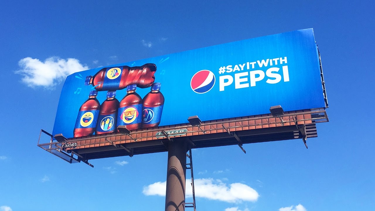
Your billboard’s design shouldn’t be an elaborate mess chock full of fancy looking text, blurry images and boring colors. It should be eye catching but simple enough to understand on the go. Your design should be able to grab someone’s attention and communicate a purpose without confusing anyone. When you’re in the design process of your next billboard, remember the following tips to make it effective.
Keep The Font Simple
Elaborate and thin font styles are often times difficult to read up close for some people and at long distances, they are almost impossible to read. Using this type of text in your billboard will cause confusion and push some people away. The style of font you use should be easy to read and have enough space between letters to prevent blurring.
Utilize Contrasting Colors
Using boring colors in your advertisement’s design is a sure way to cause people to ignore your message. Colors that are bold and highly contrasting will draw more attention to your sign so that your message can be read by a larger audience.
Use High Quality Images
Billboards are large advertising tools that require images that are equally as large and flexible. The photographs used on your billboard should have very high resolutions so that designers can use the scale to create a significant impact on the message. Large images that are detailed and clear are more influential than smaller images that lack visual flare.
Billboards Shouldn’t Have Large Amounts of Text
We are often on the road when we read billboards and as a result, we only have a few seconds to read the content. Bloating the surface of it with a large amount of content means that most of it won’t be read or it will be ignored all together. The content used on your billboard should be limited in scope and focused on a concise message.
Your Billboard Should Develop Your Brand
The design and content you implement on a billboard should be used to create widespread brand recognition. Layering the surface with phone numbers and other contact information is an ineffective practice because most people won’t have time to remember the number. Creating brand recognition with a great design and compelling content will keep your company in the minds of everyone you’re targeting for a long time to come.
Target Your Audience With A Compelling Billboard
If you try to target everyone with a message, you’ll likely fail to capture anyone. Make sure that the design and text you choose to implement on a billboard will target a specific audience’s needs. If you establish a meaningful message that appeals to a core group of people, your message will be easily remembered.


